
 Travel · Comparison platform
Global Travel Comparison Platform Redesign
VIVI CITY helps travelers compare and book tickets, tours and experiences in eight languages. We redesigned vivi.city in Figma to match the new VIVI CITY brand, upgraded its Laravel framework, built new features for finding products – and made it faster.
- Colors
- Core page types4 redesigned
- Languages8 kept
The guides had a new brand. The platform where people book still had the old one.
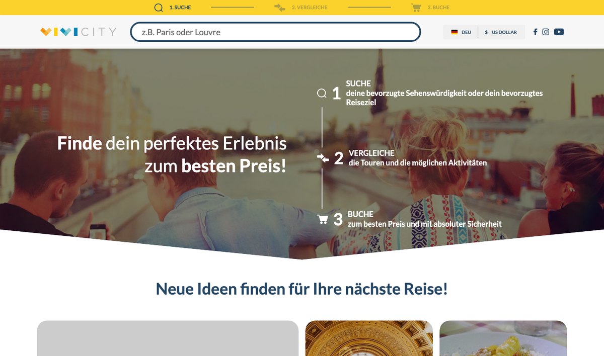
- Trust at the moment of bookingTravelers come from the VIVI city guides to compare and book. A platform that looks like another company breaks trust right before the click.
- A faster way to a productThe full-width photo hero pushed search and products down, most of all on phones.
- A platform the team can build onAn ageing Laravel codebase slowed every change – new filters, new suppliers, new pages.
We started with a design system, not with pages
The VIVI CITY brand went into Figma as a foundation and a library of components first. Every page was then built from the same parts – which is why the guides and vivi.city now feel like one company.
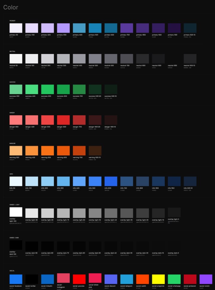
- Displayhero headlines
- Headingsection titles
- Bodyguides, product text
- LABELbuttons, chips
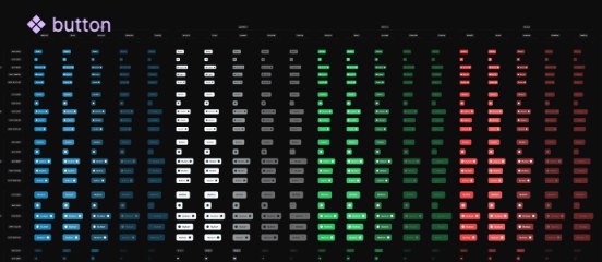
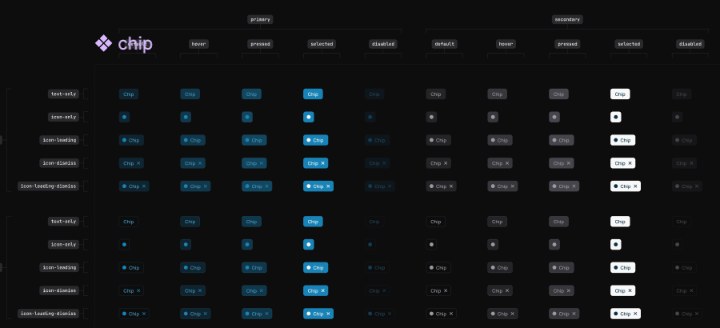
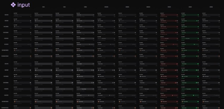
- Foundationbrand · color · typography · icons · spacing · gap · shadow · layout & grid
- Base componentsbutton · link · input · textarea · checkbox · radio · switch · avatar · badge · tag · chip · alert · tooltip · toast · dropdown · upload · progress
Design decisions – and what each one does for bookings
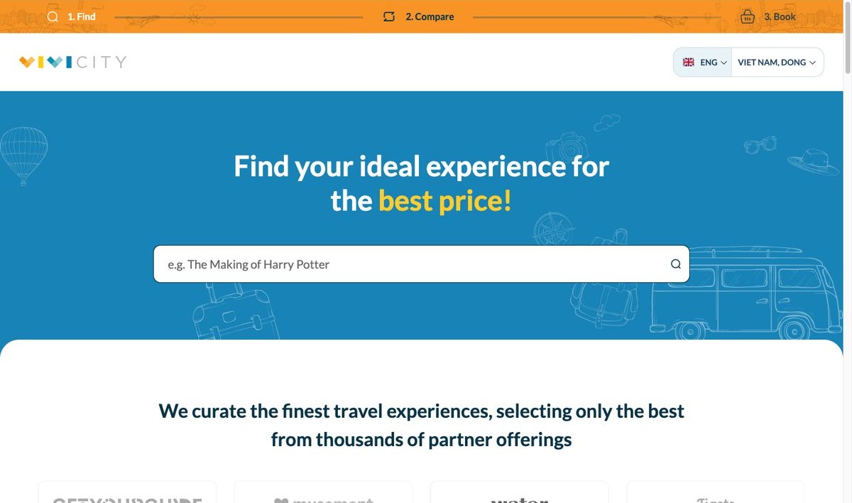
- The journey in the top bar“1 Find · 2 Compare · 3 Book” stays from the old site, now a slim orange bar above everything.Every visitor sees what vivi.city does in one line.
- Search firstOne search box in a calm blue hero instead of a full-width photo.Fewer steps between landing and a product list.
- Travel doodles, not stock photosPlane, camera, backpack and camper van drawn into the hero.The same friendly tone as the guides – and a lighter hero than a full-width photo.
- Inspiration before products“Get inspired for your next trip” – cities and experiences – before the product lists.A way in for travelers who haven’t picked a city yet.
- Comparable product cardsEvery “Top attractions” card shows supplier, duration, rating and price in the same place.Comparing – the reason people come – takes a glance.
Every pixel on the home page has a reason
Three home page directions were drawn; the second – search first – was built. Here is that frame from the Figma file, with the decisions behind it.
- Cover
- UI
- FOUNDATION
- Color
- Typography
- BASE COMPONENTS
- Button
- Input
- Chip
- Home – v2
- journey-bar
- header
- logo / vivi-city
- switch / lang · currency
- hero
- text / display
- input / search
- illustration / doodles
- get-inspired
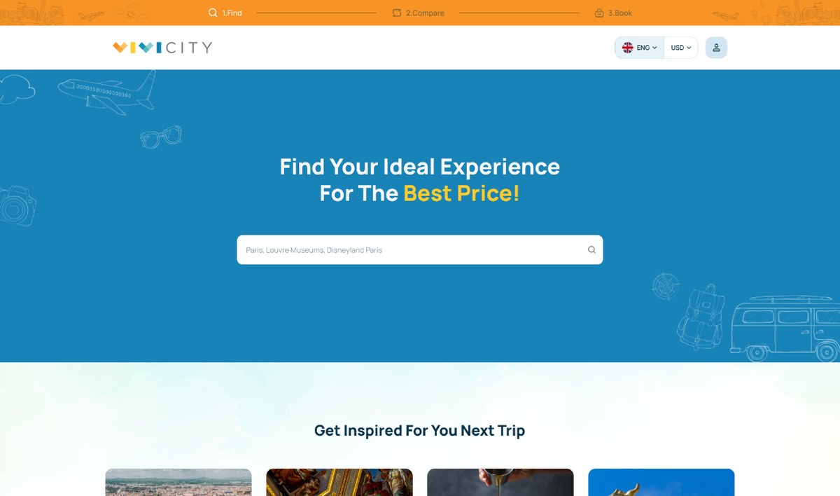
The same file holds three home page directions, the sub-pages and the mobile frames – all from one component library.
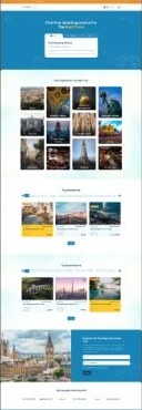
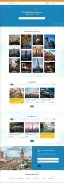 Built
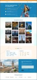
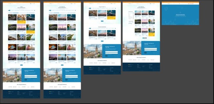
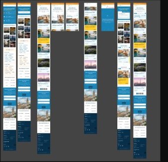
Redesign, upgrade, new features, optimize
- 01RedesignThe Figma design built for the four core page types – Home, Location, Point of Interest, “Go To” – on desktop and mobile.One brand from guide to booking.
- 02Upgrade the frameworkLaravel core upgraded, custom modules cleaned up, key back-end code refactored.Changes ship without fighting old code.
- 03New featuresReworked filters with an on-sale button, search inside a location, a Top attractions module, a “No product found” page.Travelers find the right product, and never hit a dead end.
- 04OptimizeOutdated libraries removed, a leaner codebase.A lighter, faster site that is cheaper to maintain.
The data side – supplier sync, the product API and the Google Things To Do feed – has its own case study: The Back End Behind a Travel Comparison Platform.
One brand from guide to booking – on a fast, clean platform
We didn’t just want a visual refresh, we needed a partner who could align the design with our brand and modernize our backend. ThePixel delivered both. The new look is clean, mobile-friendly, and fast. And the Laravel upgrade has made our system far easier to manage and scale. Exactly what we needed.
 Vincenzo GallianoCTO @ VIVI CITY
